Defining and designing enterprise product tiles for high-traffic B2C ecommerce
Portfolio | AT&T | Product Tiles
Challenge
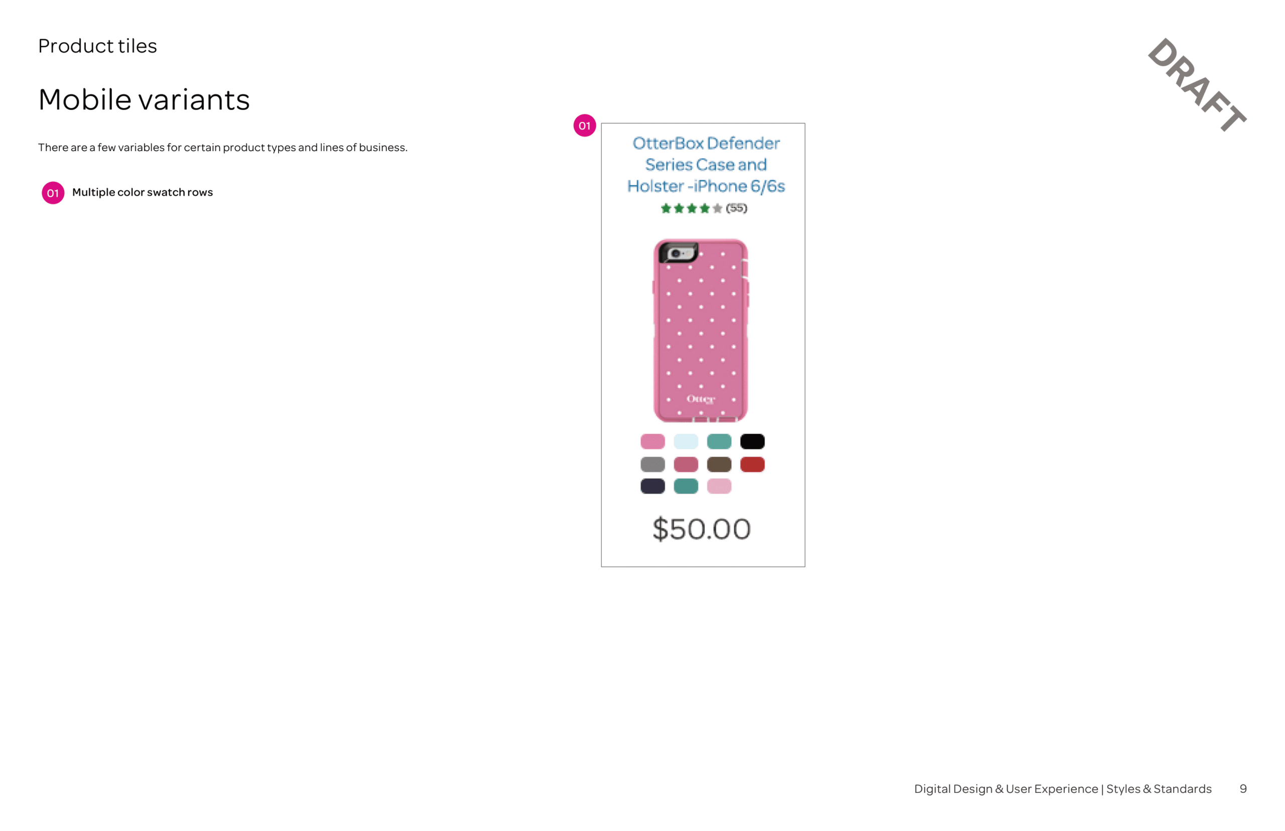
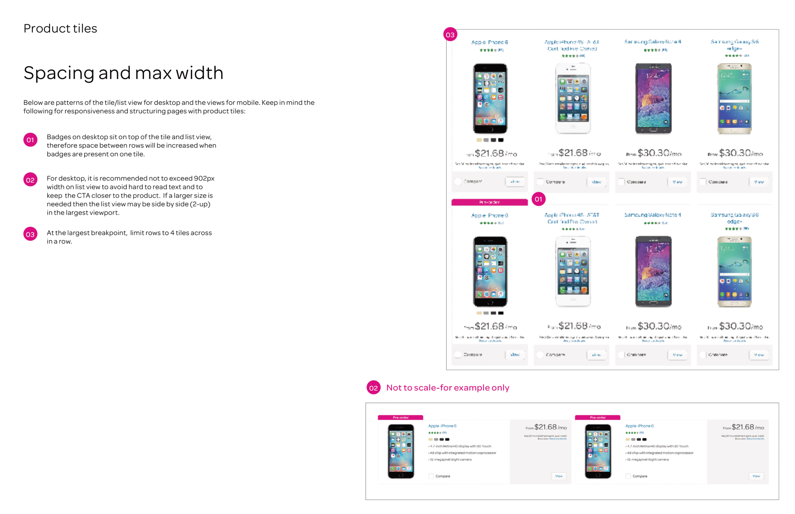
I led the redesign of AT&T’s high-traffic B2C product tiles, addressing a legacy layout that failed to showcase all available color options for popular retail items and responded poorly to high use screen sizes. These oversights contributed to cart abandonment, product exchanges, and increased call center volume. With limited screen real estate and dense content requirements, the solution demanded a refined application of logical grouping and typographic hierarchy to improve scan-ability and conversion.

Current-state audits
Best practice research
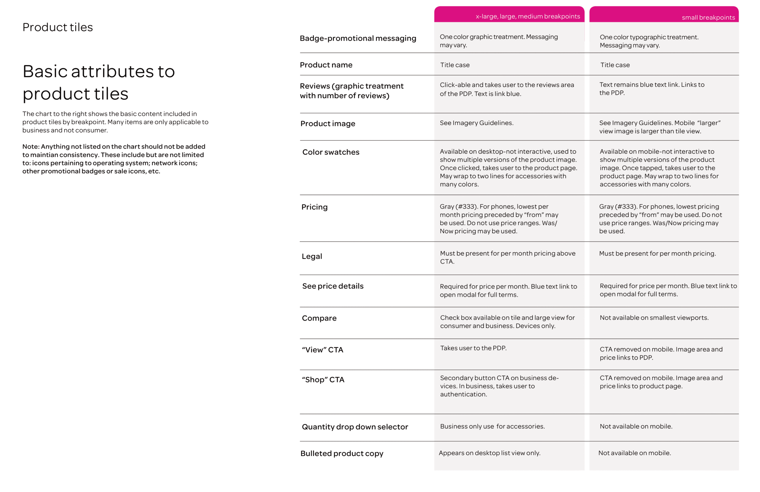
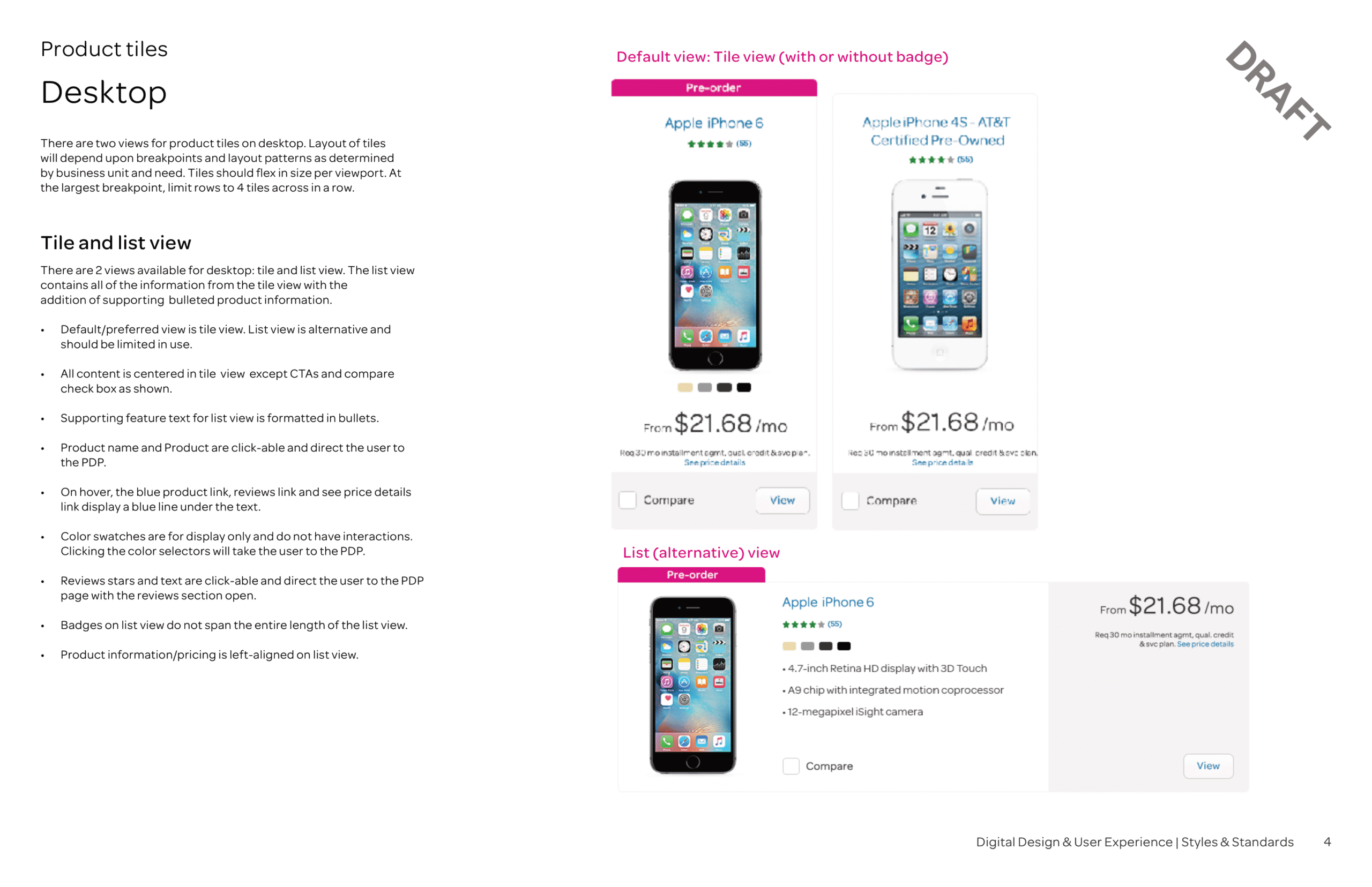
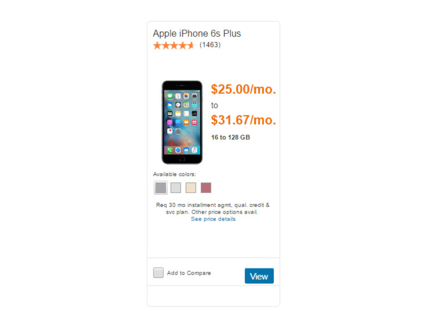
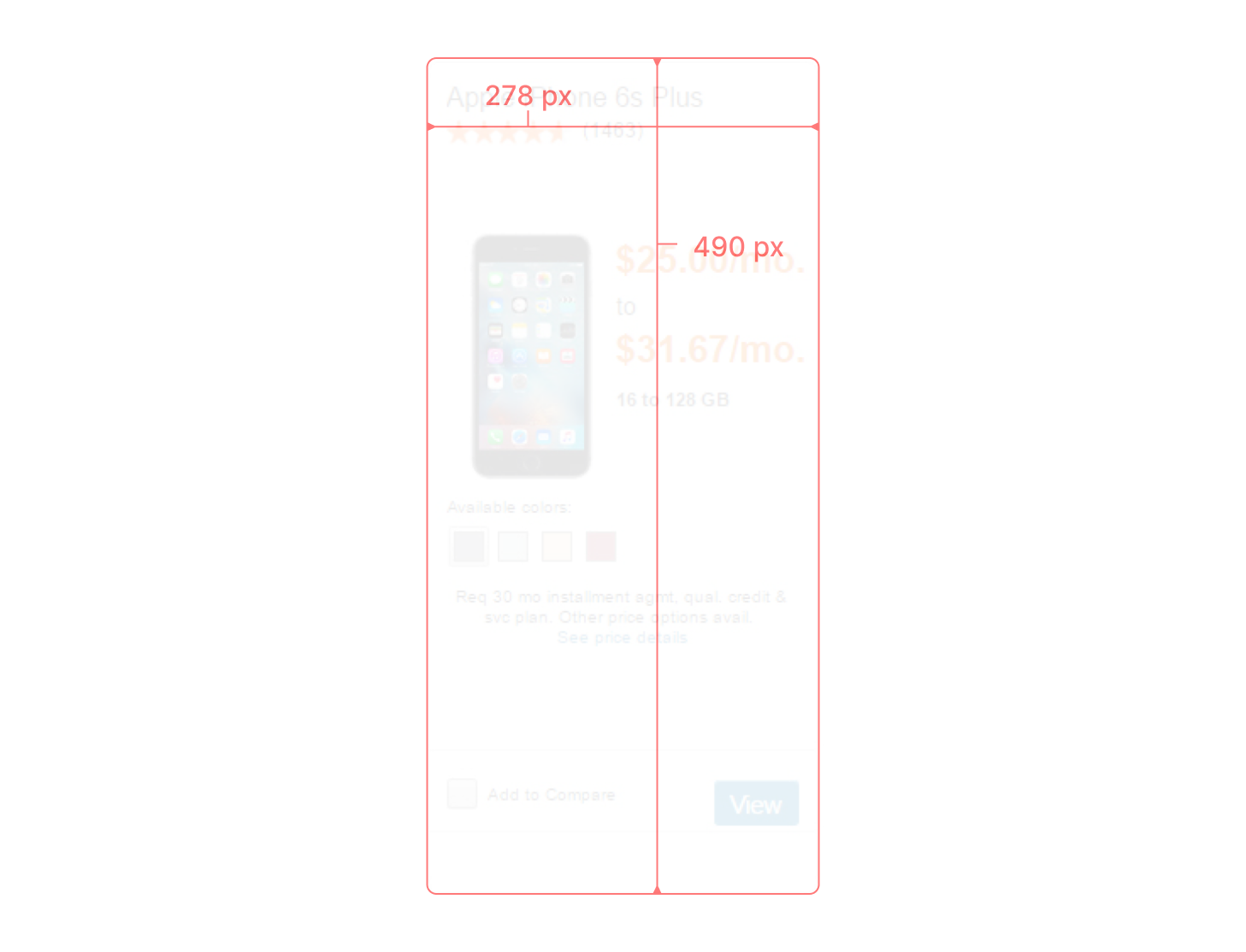
I inspected the product tile’s current state taking inventory of the content and views the product tile occupied under different situations. This discovery exercise excited conversations that ultimately informed future-state functional specifications and content requirements.
Findings
Titleline
[description]
Titleline
[description]
Titleline
[description]
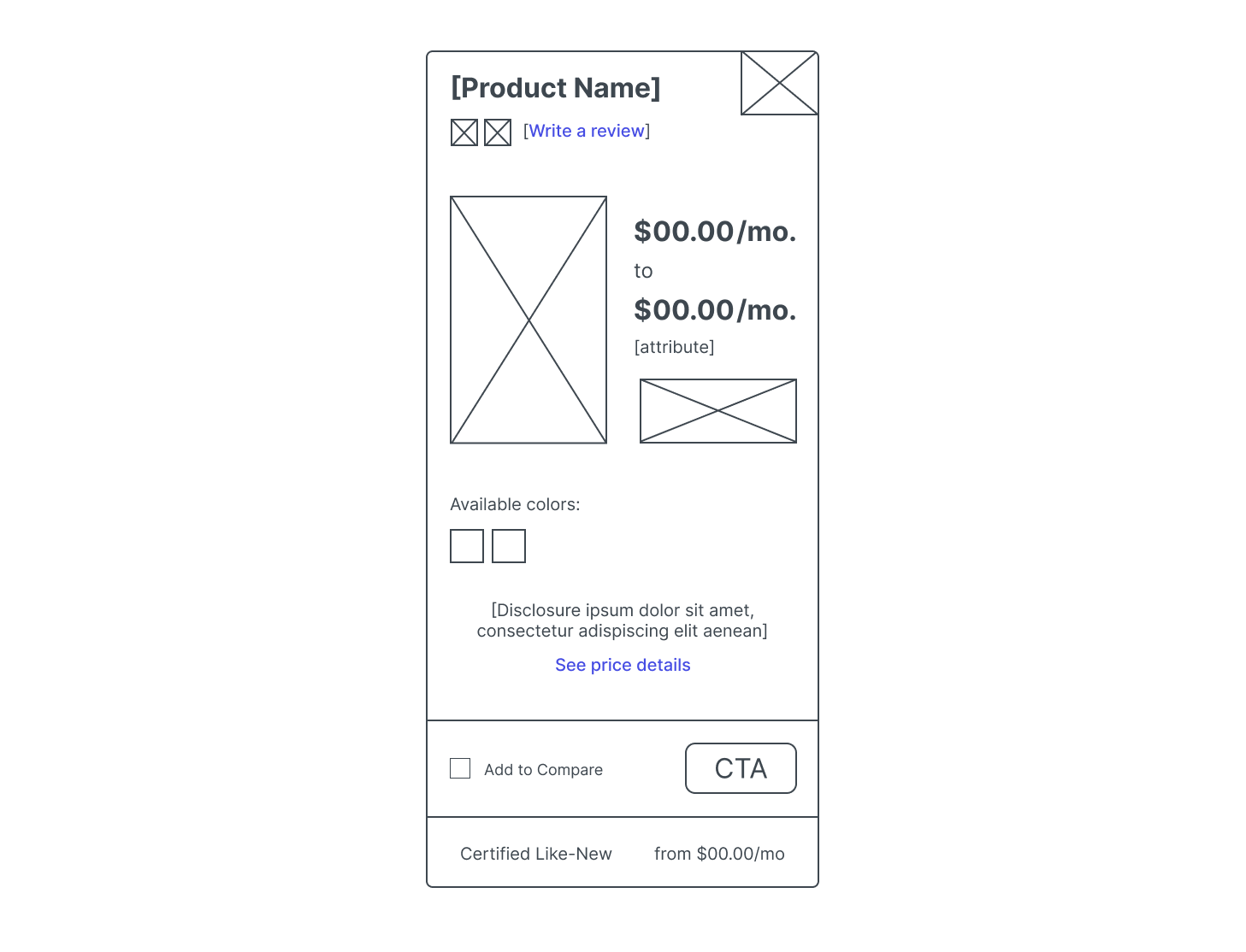
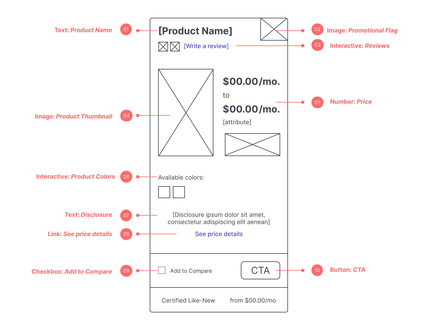
Approach
As principal design lead, I refined redesign concepts for high-traffic product tiles through bi-weekly feedback sessions with two design directors.
[Subtitle]
[description]
Current-state audits
Best practice research
I inspected the product tile’s current state taking inventory of the content and views the product tile occupied under different situations. This discovery exercise excited conversations that ultimately informed future-state functional specifications and content requirements.
A.
B.
C.

Outcomes
[Description]
[Subtitle]
[description]
[Subtitle]
Titleline
[Description]