Defining and designing enterprise standards for complex user interface controls
Portfolio | AT&T | Responsive Data Tables
Challenge
Lead visual and interaction design standards for complex UI components used in both B2B and B2C digital experiences across a global telecommunications enterprise.
A basic table pattern had already been designed prior to my involvement but was incomplete.
My challenge was to conduct a deep dive audit across B2B and B2C experiences and propose additional visual and interactive designs and responsive architecture solutions that addressed user pain points and expectations to complete this pattern’s specification.
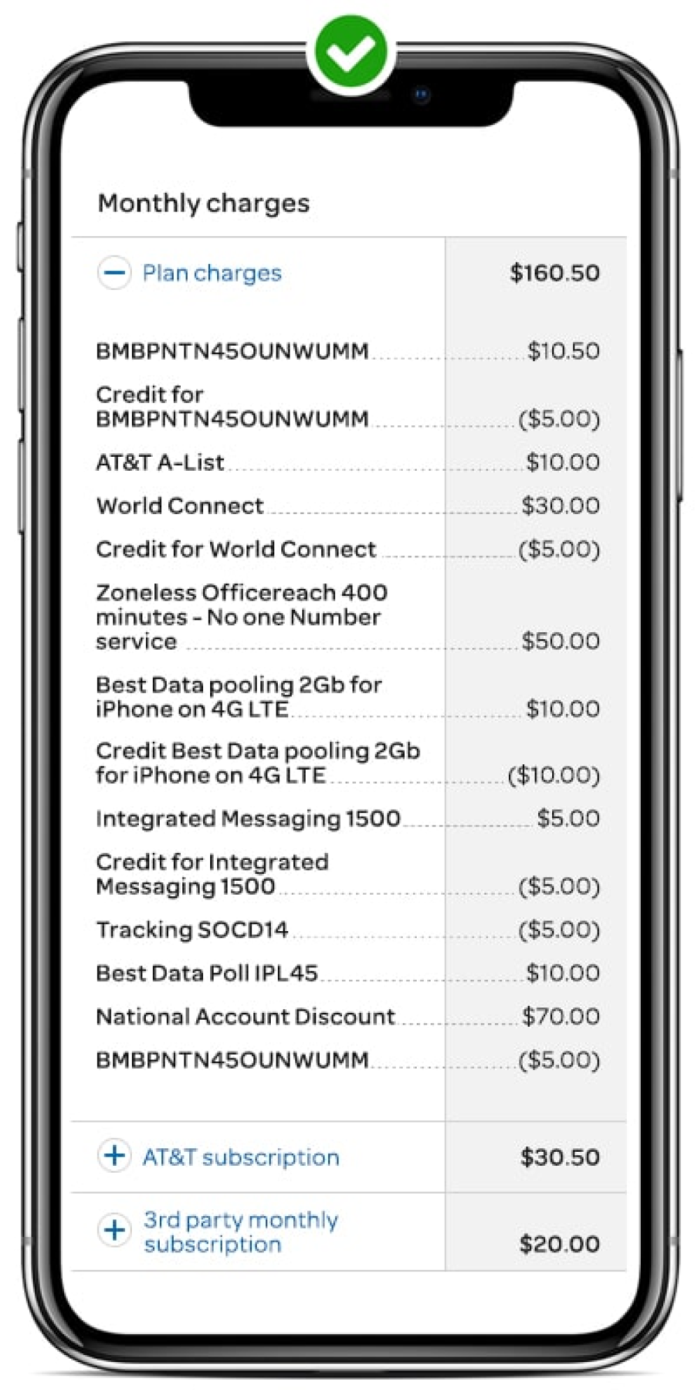
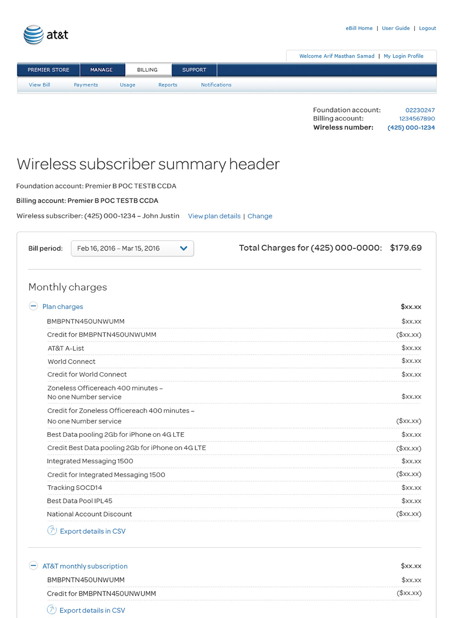
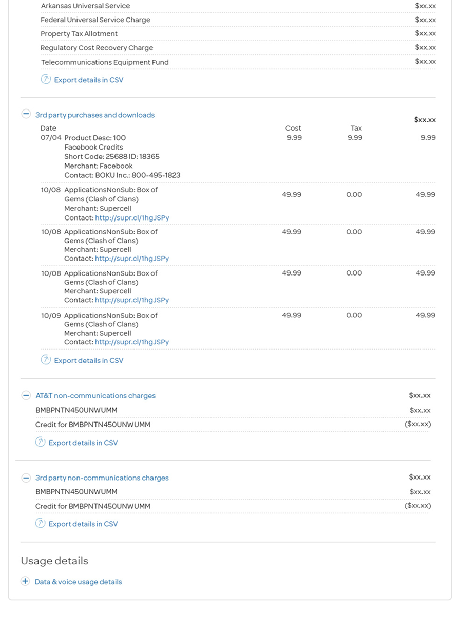
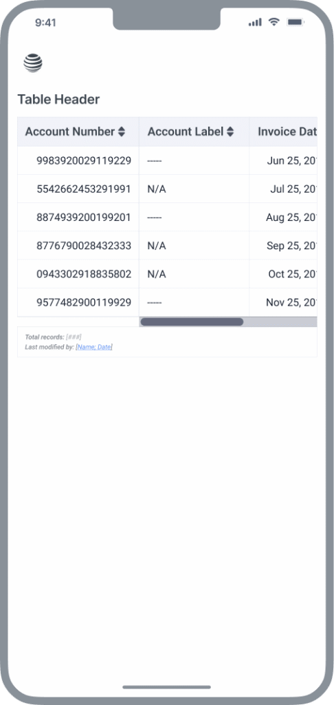
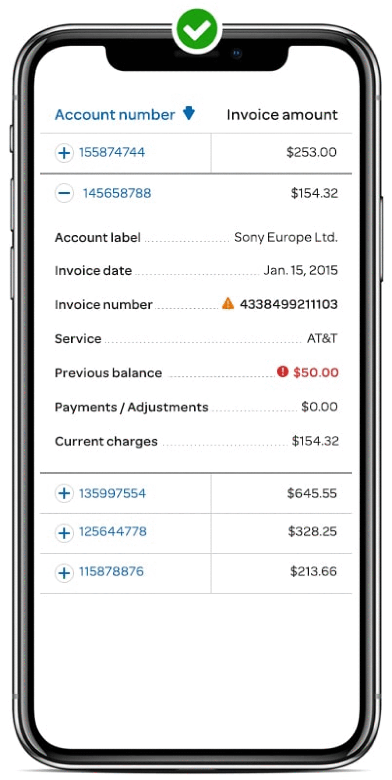
Current-state
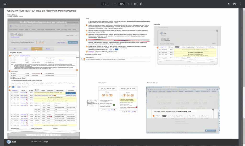
Bill history with pending payment example (B2B)
Findings
Online data tables had become too complex and disorganized to understand
Talking with a few B2B customers and inside account reps revealed data-rich tables were very “busy” and confusing. Some legacy B2B customers had simply become blind to them altogether. This resulted in customers having to calculate invoices and calling in to account reps and customer service for verification.
Call center spikes
The research revealed customer support agents and account reps were spending a significant amount of time reviewing and qualifying information already available online. This was a frustrating distraction for both customers and staff.
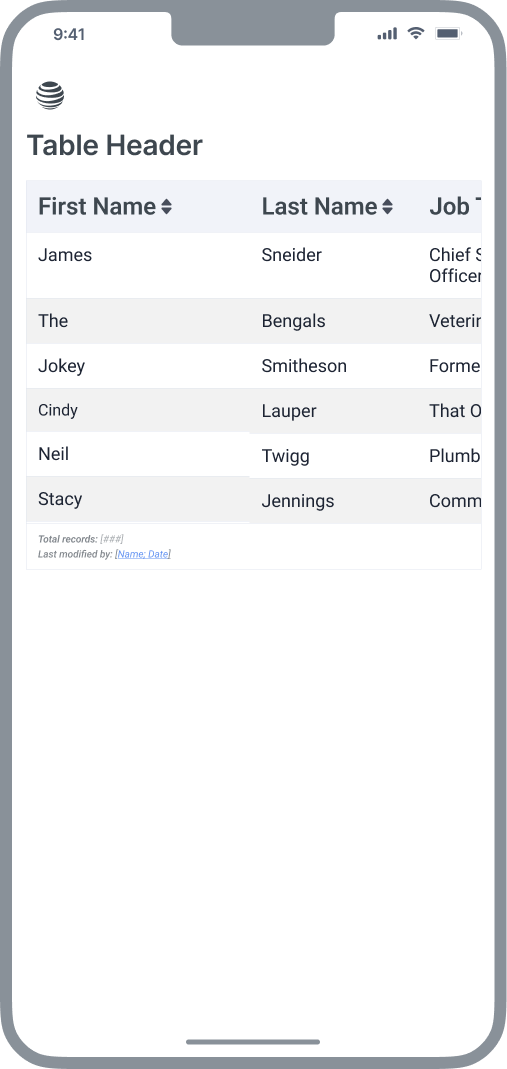
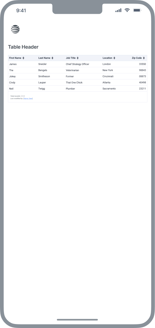
3 distinct tables types identified
The audit revealed 3 distinctly different tables types were used predominately throughout the enterprise. This included very simple, tabular data displays with just a couple columns containing small amounts of data. Conversely, a second table class was very dense with many columns containing long text strings, lists, images. The third, was a ledger style with a left column containing a long string line item description and the right column containing values, dollar amounts and sum totals.
Approach
As principal design lead, I engaged in bi-weekly critical feedback loops with two design directors. My initial research involved direct interviews with two internal B2B customer support agents and several members of the B2B Accounts Receivables team.
Choosing design principles
Best practice research
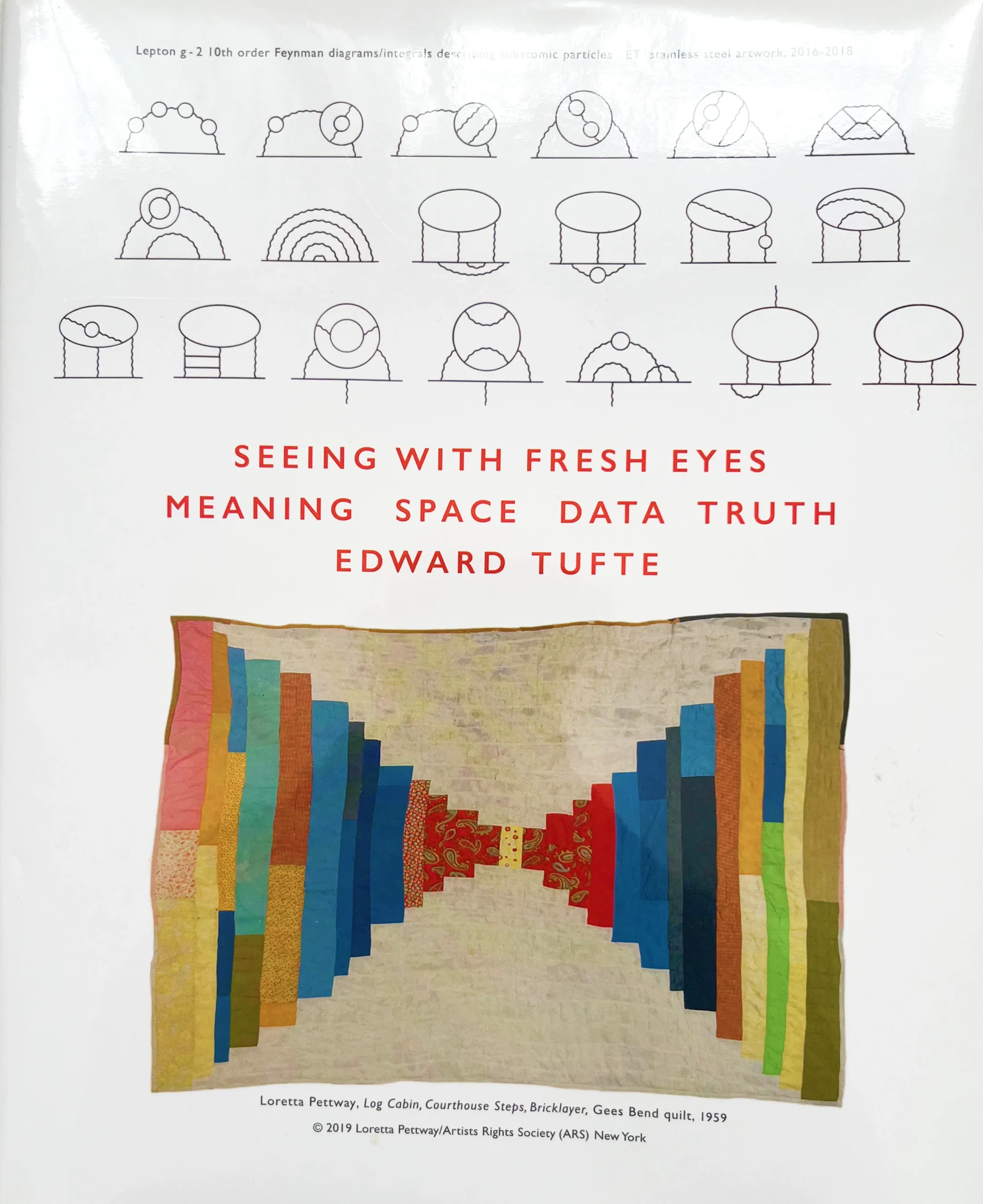
Before rushing into future state design iterations, I wanted to freshen up on my knowledge of tables from the perspectives of component architecture and cognitive science. I used the W3C and the A11y Project as sources of truth regarding component architecture and (primarily) Edward Tufte for the cognitive and content design research.

Challenging the status quo
Horizontal scrolling, pinching and zooming to view table data was not desired
I was asked to consider new ways of displaying information-dense tables on small screen devices that would challeng the status quo patterns.
Horizontal scrolling
⭣
Zoomed in (swiping)
⭣
Zoomed out (too small)
⭣
Outcomes
I led the design effort that resulted in the definition of three new table classes and interactive paradigms which were implemented across the organization, enhancing all B2B and B2C digital experiences relying on data table patterns.
[Subtitle]
[description]
New table classes
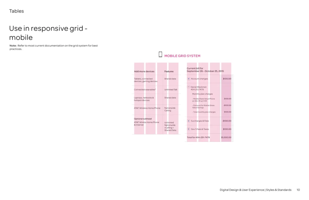
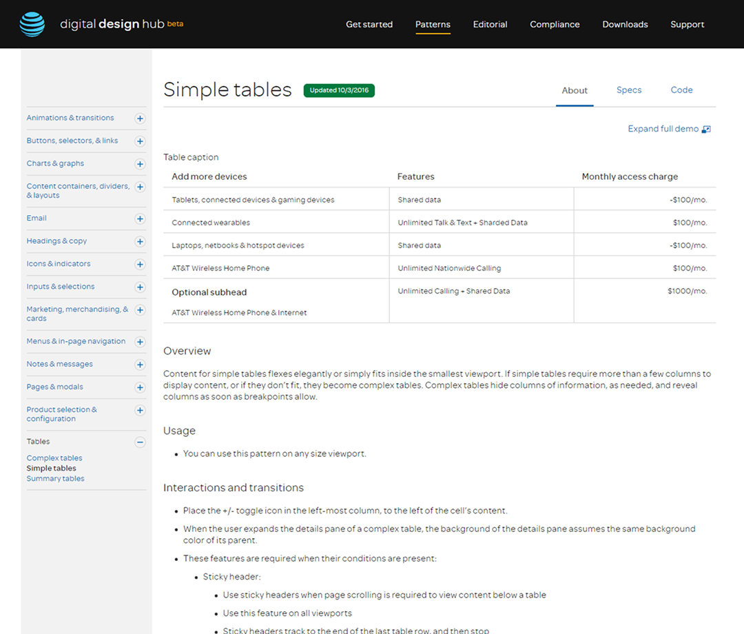
Class 1: Simple tables
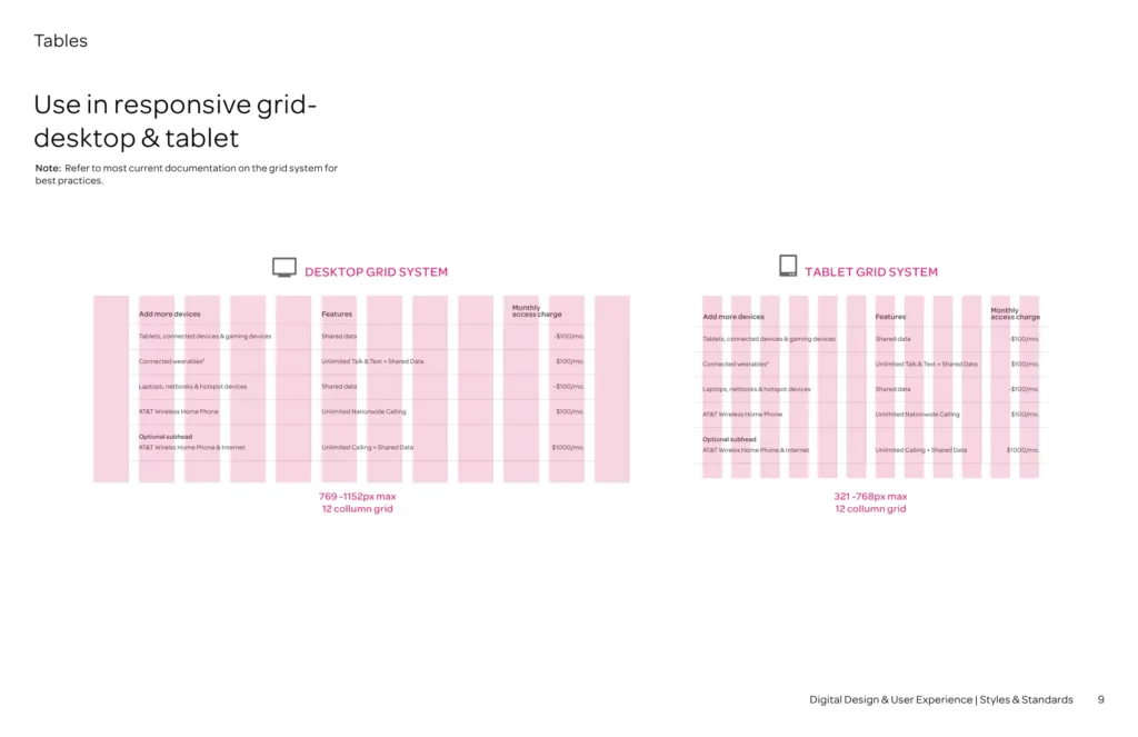
Tables classified as Simple will flex elegantly across all breakpoints (or simply fit as-is within the smallest 320px viewport). Viewing the content of a Simple table type does not require any additional user involvement (pinching, zooming, scrolling, etc.).
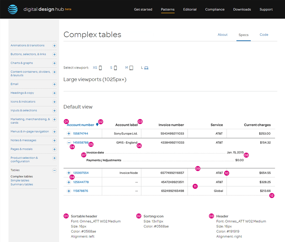
Class 2: Complex tables
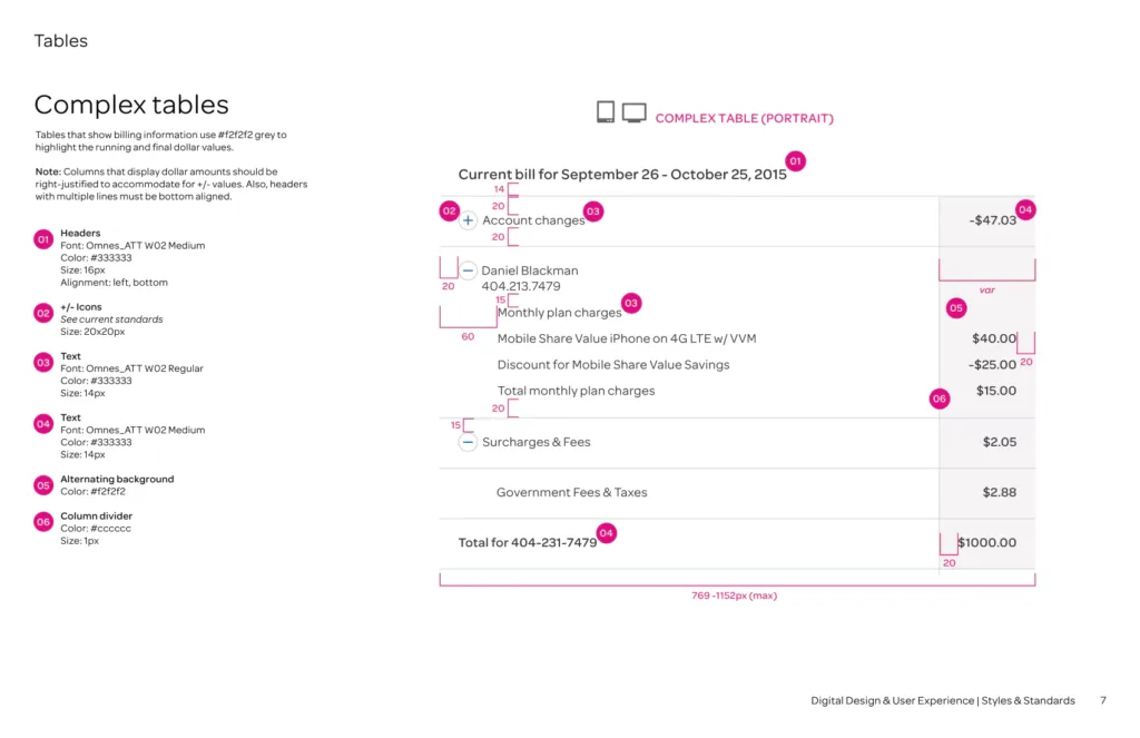
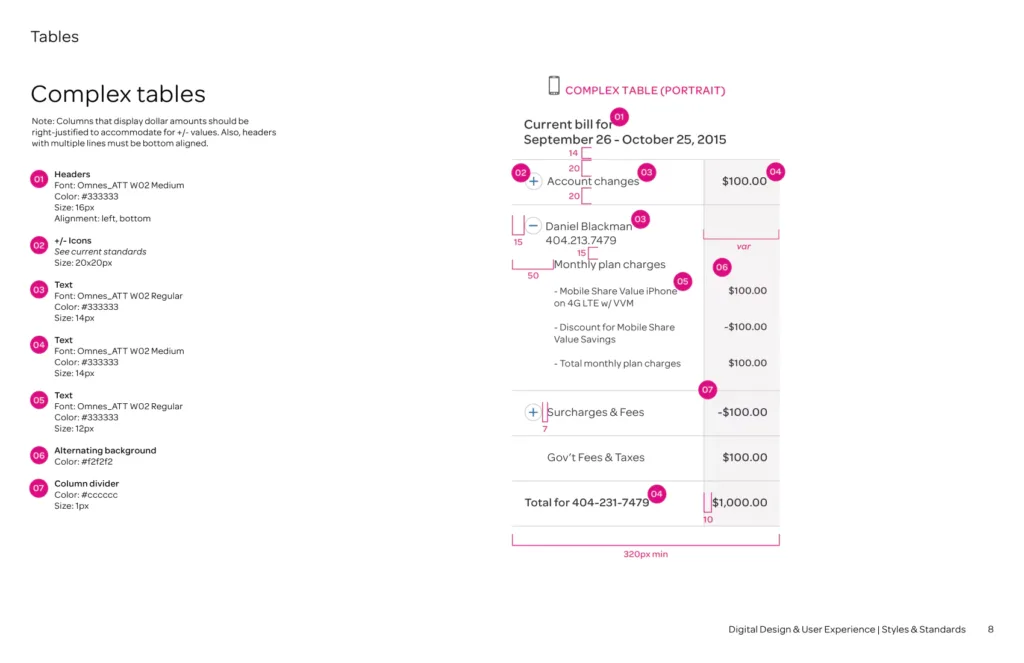
Tables classified as Complex are, essentially, Simple tables but with one key difference. Complex tables possess so much content that the table, in its complete form, can not fit elegantly within the smallest 320px viewport. Column data is simply too dense to fit comfortably without the need for additional user interaction.
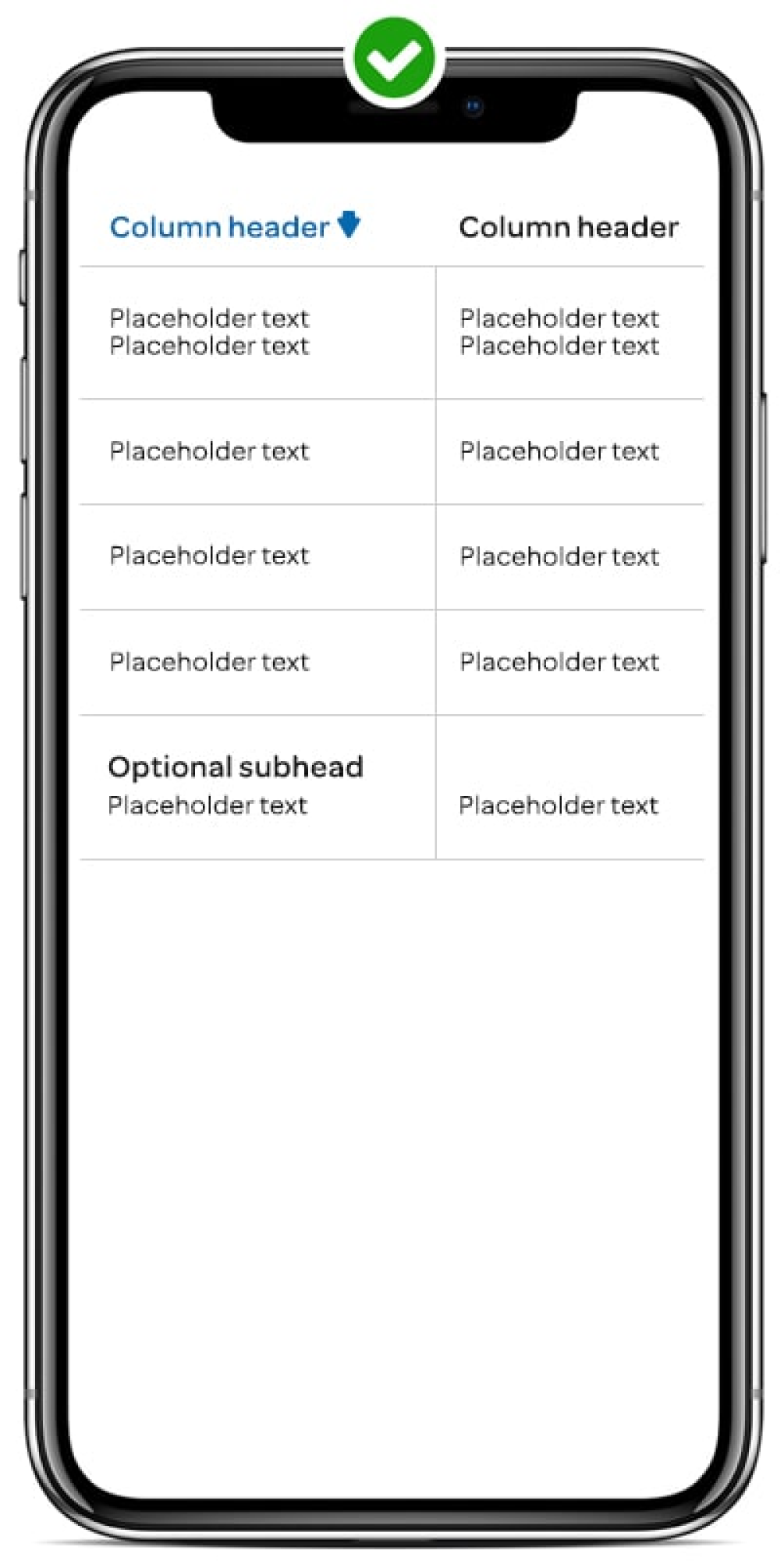
Class 3: Summary tables
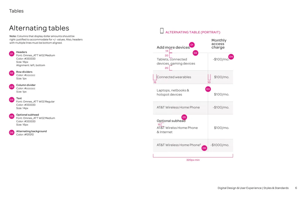
Summary tables are essentially a hybrid of the Simple and Complex table types. However, a Summary table displays only (and always) 2 columns across all breakpoints. The Summary table type is preferred when presenting accounting content in a ledger format.
New table functionality
Dynamic column visibility
Complex, information-dense tables can benefit from column surfacing at predetermined breakpoints.
Accordion-style toggling of hidden columns
Table columns could be programmatically hidden based on viewport width invoking an accordion-style list view. Icons allowed users to expand and collapse one or more rows at a time.
Fully responsive solution
Complex data tables can now be elegantly presented on any device with an intuitive interface that uses progressive disclosure to empower the user and clean up visual dissonance.
Simple
⭣
Complex
⭣
Summary / Ledger
⭣